Sashwa

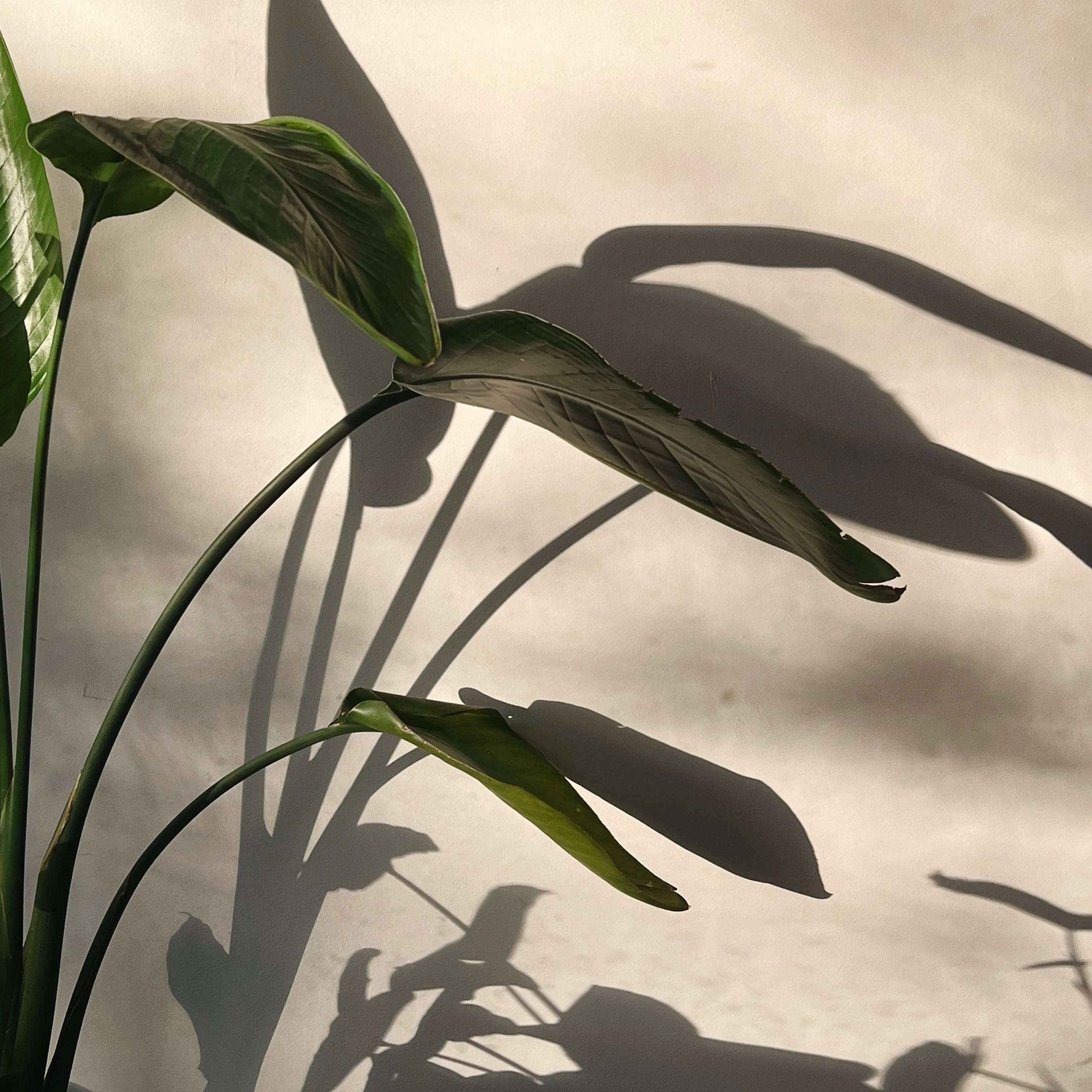
With access to a beautiful piece of land just outside the Hoedspruit area, the Sashwa team had an inspiring and unique vision for this new retreat. Focused around holistic wellness, restoration in nature and giving back to local communities, this project was full of depth and meaning from day one.
We worked with the team to understand their positioning, clarify their vision and bring to life a visual identity that they could work with easily. We crafted a custom logo suite for them and provided simple guidelines for application which enabled thee team to create a myriad of supporting materials that further enhance the guest experience. Photographs below belong to Aida from @doudabis.
Fundamental Strategy
Full Logo Suite
Colour & font Selection
Letterhead Design
Style Guide Creation
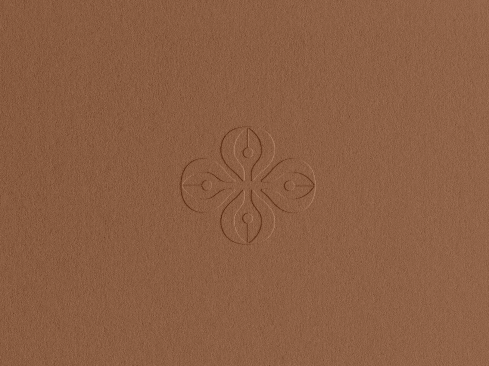

Behind the logo
The Sashwa concept is grounded in the idea of symmetry and balance. Two of the most important ideas that needed to come through. We explored illustrating a custom icon, inspired by some of the local plant life, eventually crafting the Sashwa "Seed Pod". It symbolises new beginnings, individual and collective growth and a commitment to holistic wellbeing for the self and the planet. Sashwa is a place of healing and the seedpod represents how one might retreat inward during an experience like this, and how this place offers a sanctuary for individuals to do so.


Chat to us about your project.
We’d love to hear from you.