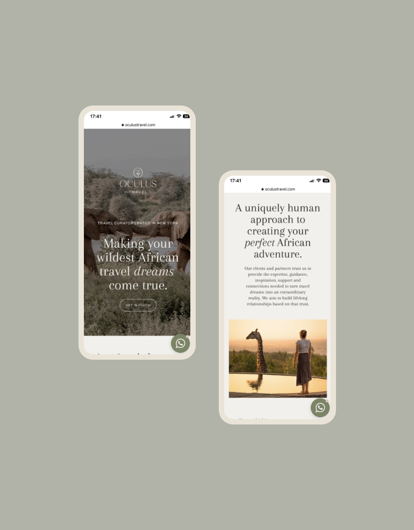
Oculus Travel
Gayle was our very first Studio Ardour client and she came to us with a vision for a new venture - Oculus Travel. 4 years ago, we set out to develop a foundational strategy, visual identity and single page website for her. Since then, her business has flourished and we've walked alongside her as her brand evolves. From the introduction of new services to an expanded brand strategy and website, Oculus is now a fully fledged, bespoke travel brand that we are proud to have been a small part of. These long-term, deeply personal relationships with our clients are what keep us inspired!
Lite Brand Strategy
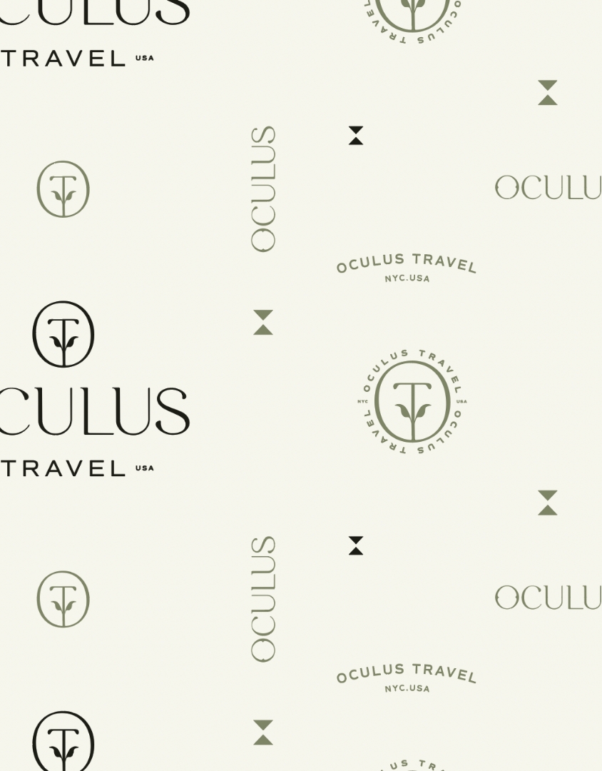
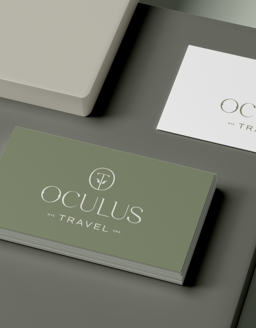
Mini logo suite
Colour palette & font suite
Style Sheet
Custom website design
Webflow development

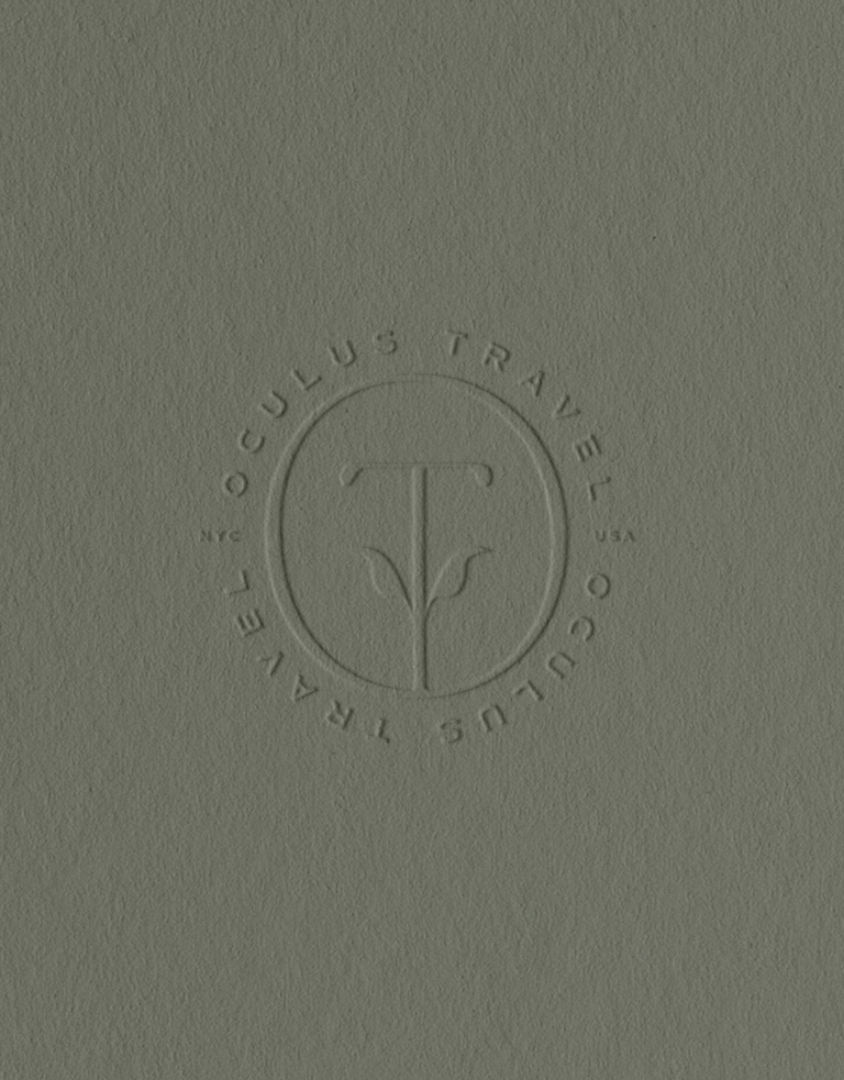
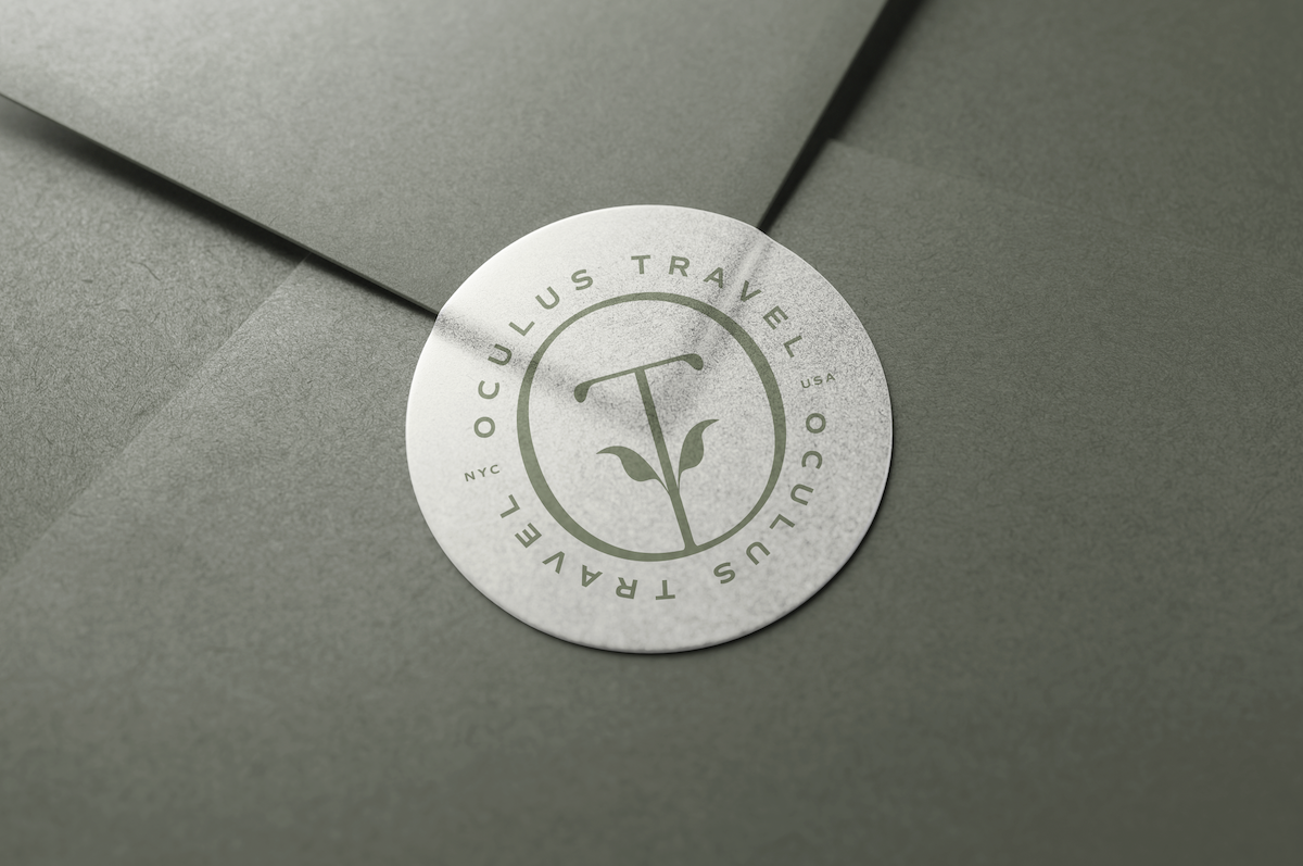
Oculus Travel's primary focus is wilderness experiences for groups - the monogram logo captures the idea of togetherness and growth, stemming from travel. The logo suite for Oculus needed to be elegant, inviting and beautiful - capturing Gayle's delicate and insightful touch with her clients. Her attention to detail is celebrated in the supporting marks and we focused on a natural, earth palette that feels safe and inviting for her clients.


Chat to us about your project.
We’d love to hear from you.